Technical Analysis Glossary
Index
Moving Average
Moving averages are used to smooth out short-term fluctuations, thus highlighting long-term trends or cycles

Chaikin Money Flow
Developed by Marc Chaikin, the Chaikin Money Flow oscillator is calculated from the daily readings of the Accumulation/Distribution Line. The basic premise behind the Accumulation Distribution Line is that the degree of buying or selling pressure can be determined by the location of the Close relative to the High and Low for the corresponding period (Closing Location Value). There is buying pressure when a stock closes in the upper half of a period’s range and there is selling pressure when a stock closes in the lower half of the period’s trading range. The Closing Location Value multiplied by volume forms the Accumulation/Distribution Value for each period. If Chaikin Money Flow is greater than zero, it is an indication of buying pressure and accumulation. The longer the oscillator can remain above zero, the stronger the evidence of accumulation. Extended periods of accumulation or buying pressure are bullish and indicate that sentiment towards the security remains positive. Not only should the oscillator remain above zero, but it should also be able to increase and attain a certain level. The more positive the reading is, the more evidence of buying pressure and accumulation.
Exponential Moving Average
Exponential moving average is a moving average that gives a greater amount of importance to the most recent data. Hence, when the price of the stock changes, this exponential moving average reacts much faster than simple moving average. 12 and 26 day EMAs are the most popular short term moving averages while 50 to 200 day EMAs are long term moving averages
Intraday Momentum Index
The Intraday Momentum Index is an oscillator which is constructed by taking an average of upward price changes (where closed is greater than open) of n days and downward price changes (where closed is less than open). Sell signals are issued when the index crosses above the overbought level of 70% and buy signals are issued when the index crosses below the oversold level of 30%. Hence, the Intraday Momentum Index takes one input parameter which is the number of periods used to construct the up and down price change averages.
Price ROC (Rate of Change)
The Price Rate of Change (ROC) indicator shows traders the difference between the price of a security at present and the price at a given number of trading periods ago. The ROC is considered to indicate over valued / overbought positions when the indicator is at a peak and under valued / oversold conditions when the indicator is at a minimum. A signal line, which is a moving average of the ROC, is used to indicate trend reversals. Formula to calculate PROC is:
Closing Price Today – Closing Price “n” Periods Ago / Closing Price “n” Periods Ago
The Price ROC hence measures the rate and strength of change. The Price Rate of Change plot requires two inputs: the period of comparison for the price and the averaging period used for the signal line.
MACD Chart
Moving average convergence-divergence (MACD) is constructed by subtracting a slow moving average from a fast moving average i.e. it is calculated by subtracting the 26-day exponential moving average (EMA) from the 12-day EMA. A 9-day EMA of the MACD, called the “signal line,” is then plotted on top of the MACD and a histogram is shown representing the divergence between the MACD line and the signal line. The signal line hence serves the purpose of a trigger for buy and sell signals. The typical MACD trading rule is to sell when the MACD falls below its signal line and to buy when the MACD rises above its signal line. Traders also watch for a move above or below the zero line because this signals the position of the short-term average relative to the long-term average. When the MACD is above zero, the short-term average is above the long-term average, which signals upward momentum. The opposite is true when the MACD is below zero.
Relative Strength Index
The Relative Strength Index (RSI) is an oscillator which is constructed as the ratio of average upward price changes to the average absolute price change. The price changes are determined by comparing the current close to the previous close and the averaging period is determined by the user. The RSI is typically viewed as a means of either confirming or denying price movements. When the RSI rises above 20% it is used to issue buy signals and when the RSI falls below 80% it is used to issue sell signals. This means that an asset is deemed to be overbought once the RSI approaches the 80 level, meaning that it may be getting overvalued and is a good candidate for a pullback. Likewise, if the RSI approaches 20, it is an indication that the asset may be getting oversold and therefore likely to become undervalued.
The RSI takes one input parameter which is the number of days used to construct the up and down price change averages.
The RSI is calculated by the following formula:
RSI = 100 – 100 / 1 + RS
Where RS = Average of x days up closes/ Average of x days down closes
Simple Moving Average
A simple moving average is referred to the average price of stock over a certain period of time. It is the sum of all the closing prices of a security for a number of time periods, dividing it by the number of time periods. Equal weighting is given to each daily price. Simple Moving Averages are divided into short term (fast moving averages) and long term (slow moving average). While the short term moving averages are faster to respond to changes in the price of stock, the long term averages are slower to react. The basic simple moving average trading rule is to sell when the fast moving average falls below the slow moving average and buy when the fast moving average rises above the slow moving average.
Stochastic Oscillator
The Stochastic Oscillator is a tool to determine the trend in the movements of prices by comparing the closing prices with the highs and lows of current trading ranges. The idea behind this is that the stock will close at the upper end of a trading range of a given period when the trend of price is upward and will close at the lower end of a given range when the price is trending downward.
Fast Stochastic Oscillator
The fast Stochastic Oscillator (k) involves addition of a number of days’ (multiple days) worth of comparisons between the daily closing prices of stock and the high and low prices.
Slow Stochastic Oscillator
The slow stochastic oscillator (d) is typically the average of a 3 period sum of the fast stochastic oscillator k. To calculate this, the following is required: (1) the period over which the high and low prices will be calculated for comparison with the present day’s closing price; (2) The summing period for k; and (3) The averaging period for d.
Bollinger Bands
Bollinger Bands are lines which are a user-specified number of standard deviations above and below a simple moving average. For example, a 30-3.0 Bollinger Band overlay would display lines which are 3 standard deviations above (Upper Bollinger) and 3 standard deviations below (Lower Bollinger) a 30 day simple moving average of the price (the Bollinger Middle). These Upper, Middle and Lower bands expand and contract as the price action of an issue becomes volatile (expansion) or becomes bound into a tight trading pattern (contraction).
Bollinger Upper
Bollinger Upper refers to a price target above the simple moving average i.e. a display line representing the number of standard deviations above the simple moving average. The Upper Bollinger band is important because it tells the trader that the most recent closing price, if it has a value close to 100 %, is much closer to the Upper Band. When the stock price continually touches the Upper Bollinger Band, the price is thought to be overbought and traders feel it is a good time to sell.
Bollinger Middle
Bollinger Middle is simply the Simple Moving Average. It could be a 20 day average or a 30 day average. The Middle Bollinger serves as a baseline to determine fluctuations in the closing prices of stocks and warn traders about the right time to sell or buy stock.
Bollinger Lower
Bollinger Lower refers to a price target below the simple moving average i.e. a display line representing the number of standard deviations below the simple moving average. The Lower Bollinger band is important because it tells the trader that the most recent closing price, if it has a value close to 0 %, is much closer to the Lower Band. When the stock prices continually touch the lower band, the prices are thought to be oversold, and a buy signal thus kicks in.
William %R
William R is very similar to the Scholastic Oscillator with the only difference that the peaks of William R indicate conditions of overselling whereas the minimum values indicate conditions of under selling; a complete reversal of the Scholastic Oscillator. In this too the daily high and low price is compared to the closing price. Overbought and Oversold lines are set at 20-80 .
Stochastic Momentum Index
A smoother version of the Stochastic Oscillator, the Stochastic Momentum Index (SMI) is constructed by comparing the closing price to the average of the high low price range over a given period. When the SMI crosses above its signal line i.e. the double Exponential Moving Average (an EMA of an EMA of the raw price differences), buy signals are issued and when it crosses below its signal lines sell signals are issued. The SMI requires computation of high low prices, the number of periods for the smoothing averages, and the number of periods for the smoothing line.
TRIX
The TRIX is similar to the Stochastic Momentum Index with the difference that it is the rate of change of the “triple” exponential moving average of the closing price (EMA of EMA of EMA of close). The TRIX signal line is thus the exponential moving average of the TRIX line. TRIX requires the moving average period for the TRIX and the moving average period for the signal line.
Volume Oscillator
The Volume Oscillator displays the difference of two moving averages of the security’s volume as a percentage.
Qstick
The Qstick indicator is the average of the closing and opening price for n number of periods. The EMA of the Qstick is used as a signal line. Buy signals are issued when the QStick moves above its signal line and sell signals are issued when the QStick crosses below its signal line. The Qstick requires the number of periods for the Qstick calculation and the number of periods for the signal line.
MACD Chart
An MACD Chart is a graphical representation that shows the divergence between the MACD line and the signal line which helps to determine that when the MACD falls below the signal line traders should sell stock and vice versa.
MACD Histogram
An MACD Histogram is a graphical representation that shows the divergence between the MACD line and the signal line which helps to determine that when the MACD falls below the signal line, traders should sell stock and vice versa. A histogram plot makes it easier to see the crossovers on MACD.
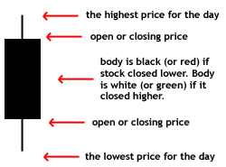
Candlestick
A price chart that displays the low, high, open, and close for a security each day over a specified period of time.
Hammer
A price pattern in candlestick charting that occurs when a security trades significantly lower than its opening, but rallies later in the day to close either above or close to its opening price. This pattern forms a hammer-shaped candlestick. A hammer occurs after a security has been declining, possibly suggesting that the market is attempting to determine a bottom. The signal does not mean bullish investors have taken full control of a security, it simply indicates that the bulls are strengthening. The hammer and the hanging man are both the same line that is a small real body (white or black) at the top of the session’s range and a very long lower shadow with little or no upper shadow. When this line appears during a downtrend it becomes a bullish hammer. For a classic hammer, the lower shadow should be at least twice the height of the real body.

Hammering the market
The selling of large amounts of a stock by speculators who believe that stock will soon fall, therefore sell short, is said hammering the market.
Hanging man
A bearish candlestick pattern that forms at the end of an uptrend. It is created when there is a significant sell-off near the market open, but buyers are able to push this stock back up so that it closes at or near the opening price. Generally the large sell-off is seen as an early indication that the bulls (buyers) are losing control and demand for the asset is waning. This formation does not mean that the bulls have definitively lost control, but it may be an early sign that the momentum is decreasing and the direction of the asset may be getting ready to change. The reliability of this signal is drastically improved when the price of the asset decreases the day after the signal. Hanging man formations can be more easily identified in intraday charts than daily charts, and are a very popular formation used by day traders.

![]()
Shooting Star
The Shooting Star is a bearish single day pattern that appears during an uptrend. It opens higher, trades still higher, creating a long upper shadow. It then closes near its open, leaving no lower shadow, and a small real body. Looks like the Inverted Hammer but gives a bearish signal.
Inverted Hammer
An Inverted Hammer forms when the Upper Shadow is longer than the Real Body and the Lower Shadow is small or non-existent. The Inverted Hammer is the same as a Shooting Star, only the Inverted Hammer appears at the end of a downtrend, whereas the Shooting Star appears at the end of an uptrend.

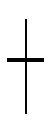
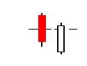
Doji
A specific pattern of a candlestick chart that indicates that a security’s open and close prices were nearly identical. A doji generally looks like a cross or a plus sign. The length of the upper and lower shadows, or wick, of a Doji vary so that it may look like a cross, inverted cross or a plus sign.
Bullish Engulfing
A chart pattern that forms when a small black (or red) candlestick is followed by a large white (or green) candlestick that completely eclipses or “engulfs” the previous day’s candlestick. The shadows or tails of the small candlestick are short, which enables the body of the large candlestick to cover the entire candlestick from the previous day. As implied in its name, this trend suggests that the bulls have taken control of a security’s price movement from the bears. This type of pattern usually accompanies a declining trend in a security, suggesting that a low or end to a security’s decline has occurred. However, as usual in candlestick analysis, the trader must take the preceding and following days’ prices into account before making any decisions regarding the security.

Bearish Engulfing
A chart pattern that consists of a small white candlestick with short shadows or tails followed by a large black candlestick that eclipses or “engulfs” the small white one. As implied by its name, a bearish engulfing pattern may provide an indication of a future bearish trend. This type of pattern usually accompanies an uptrend in a security, possibly signaling a peak or slowdown in its advancement. However, whenever a trader analyzes any candlestick pattern, it’s important for him or her, before making any decisions, to consider the prices of the days that precede and follow the formation of the pattern.

Pierce Line
The Piercing Line Pattern is a bullish reversal pattern and the opposite of the Dark Cloud Cover. This formation appears during a downtrend, with the first of two bear bearish (red or black) with a long body. The following trading day prices open at a new low, but trade higher and close at a level where the candle reaches above the midpoint of the prior day’s body.
Dark Cloud Cover
A bearish reversal signal. In an uptrend a long white candlestick is followed by a black candlestick that opens above the prior white candlestick’s high. It then closes well into the white candlestick’s real body.

Bullish
Perception regarding a particular security, sector or overall market is about to rise.
Bearish
Perception regarding a particular security, sector or overall market is about to fall. Bearish indicates the falling trades of the market.
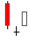
Morning Star
A bullish candlestick pattern that consists of three candles that have demonstrated the following characteristics:
- The first bar is a large red candlestick located within a defined downtrend.
- The second bar is a small-bodied candle (either red or white) that closes below the first red bar.
- The last bar is a large white candle that opens above the middle candle and closes near the center of the first bar’s body.
This pattern is used by traders as an early indication that the downtrend is about to reverse.
![]()

Morning Doji Star
Morning doji star is same as a morning star except the middle candlestick is a doji instead of a small real body. Because there is a doji in this pattern it is considered more bullish than the regular morning star.
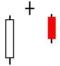
Evening Star
A bearish candlestick pattern consisting of three candles that have demonstrated the following characteristics:
- The first bar is a large white candlestick located within an uptrend.
- The middle bar is a small-bodied candle (red or white) that closes above the first white bar.
- The last bar is a large red candle that opens below the middle candle and closes near the center of the first bar’s body.
This pattern is used by traders as an early indication that the uptrend is about to reverse.

Evening star formations can be useful in determining trend changes, particularly when used in conjunction with other indicators.
Evening Doji Star
The same as an evening star except the middle candlestick (i.e. the star portion) is a doji instead of a small real body. Because there is a doji in this pattern, it is considered more bearish than the regular evening star.
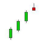
Three White Soldiers
A bullish candlestick pattern that is used to predict the reversal of the current downtrend. This pattern consists of three consecutive long-bodied candlesticks that have closed higher than the previous day, with each session’s open occurring within the body of the previous candle. These long-bodied candlesticks are a sign of the change in investor sentiment and are used by traders to confirm a shift in momentum. This pattern may form after a period of consolidation, which is still a valid sign of a move higher, but it is not as desirable as it would be if it were found at the end of a prolonged downtrend.
Three Black Crows
A bearish candlestick pattern that is used to predict the reversal of the current uptrend. This pattern consists of three consecutive long-bodied candlesticks that have closed lower than the previous day with each session’s open occurring within the body of the previous candle. The three black crows’ pattern is a sign of the bulls’ lack of conviction in the current uptrend. This pattern is used to predict the top of an uptrend, but traders will want to confirm this signal with other technical indicators to confirm that the momentum is actually changing